trend documentation
trend calculates the linear trend of a data series by least squares. Data do not need to be equally spaced in time.
See also detrend3.
Back to Climate Data Tools Contents.
Contents
Syntax
tr = trend(y)
tr = trend(y,Fs)
tr = trend(y,t)
tr = trend(...,'dim',dim)
tr = trend(...,'omitnan')
[tr,p] = trend(...)
[tr,p] = trend(...,corrOptions)
Description
tr = trend(y) calculates the linear trend per sample of y.
tr = trend(y,Fs) specifies a sampling rate Fs. For example, to obtain a trend per year from data collected at monthly resolution, set Fs equal to 12. This syntax assumes all values in y are equally spaced in time.
tr = trend(y,t) specifies a vector t relative to which the trend is calculated. Each element of t corresponds to a measurement in y, and when this syntax is used, times do not need to be equally spaced. Units of the trend are (units y)/units(t) so if the units of t are in days (such as datenum), multiply by 365.25 to obtain the trend per year.
tr = trend(...,'dim',dim) specifies the dimension along which the trend is calculated. By default, if y is a 1D array, the trend is calculated along the first nonsingleton dimension of y; if y is a 2D matrix, the trend is calcaulated down the rows (dimension 1) of y; if y is a 3D matrix, the trend is calculated down dimension 3.
tr = trend(...,'omitnan') solves the least squares trend, even where not all values of y are finite. This option may be somewhat slow if many grid cells contain some, but not all, NaNs. A word of caution when using the 'omitnan' option: the trend is calculated only over the timespan in which finite data exist. Therefore, for example, if some grid cells contain finite data only for one year of a 10 year record, it is possible that the apparent "10 year" trend reported by the trend function could actually be an aliased signal. Accordingly, the 'omitnan' option should only be used when NaNs are scattered somewhat evenly throughout the temporal record.
[tr,p] = trend(...) returns the p-value of statistical significance of the trend. (Requires the Statistics Toolbox)
[tr,p] = trend(...,corrOptions) specifies any optional Name-Value pair arguments accpted by the corr function. For example, 'Type','Kendall' specifies computing Kendall's tau correlation coefficient.
Example 1: 1D Array
Here's a time series sampled at 12 times per year:
Fs = 12;                   % sampling rate (12 samples per year)
t = (2000:1/Fs:2007)';     % time vector sampled at Fs per unit time
y = 40*t + 123*rand(size(t)) - 8e4; % forced trend of 40 units y per second

plot(t,y)
xlabel 'time'
ylabel 'some variable'

It's easy to overlay a trendline on that plot with polyplot like this:
hold on
polyplot(t,y,1)

...but what's the numerical value of that trend? In other words, how steep is the slope? When we defined y, we specified that it should be 40*t (plus some random noise and an offset), so the trend should be about 40:
trend(y)
ans =
    3.2710
That trend isn't even close to 40! That's because if we don't specify a sampling frequency or a time vector, the trend function gives the trend in y per sample. Specify the sampling rate of 12 samples per year like this:
trend(y,Fs)
ans =
   39.2522
...and that's the value close to 40 that we were expecting. It's not exactly 40 because we intentionally added noise, but it's about 40, as expected.
You may have noticed by now that the trend can be calculated any of three ways, and each will give the same answer. You can multiply the trend by the sampling rate, or you can specify the sampling rate in the trend function, or you can specify the corresponding time vector t, and they'll all give the same answer:
[trend(y)*Fs trend(y,Fs) trend(y,t)]
ans =
   39.2522   39.2522   39.2522
Example 2: 2D data
If you have a bunch of measurements that all line up to the same times, the trend function can calculate all the trends at once, in a computationally efficient manner. Consider these four time series built from the y array we defined in example 1:
%   [y    y+400        very noisy y           only noise     ];
A = [y    y+400     y+200*randn(size(y))    100*rand(size(y))];

figure
plot(t,A)
legend('column 1','column 2','column 3','column 4',...
   'location','northwest')
xlabel 'time'
ylabel 'some variable'
axis tight
box off       % removes ugly frame from axes
legend boxoff % removes ugly frame from legend
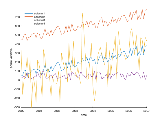
The trends of each column can be computed like this:
trend(A,t)
ans =
   39.2522   39.2522   56.5252    2.6557
That's what we expected: About 40 units/year for columns 1 and 2, which are the same data aside from the offset; somewhat of a trend for column 3, and not much of a trend for the noise-only column 4.
Are any of these trends statistically significant? Use the optional second function output to see:
[tr,p] = trend(A,t)
tr =
   39.2522   39.2522   56.5252    2.6557
p =
    0.0000    0.0000    0.0000    0.0732
The p values for the first three columns indicate statistical significance, but the fourth column tells us that any trend measured there is probably junk.
What if your data go across columns through time instead of down rows? Just specify the dimension:
[tr,p] = trend(A',t,'dim',2)
tr =
   39.2522
   39.2522
   56.5252
    2.6557
p =
    0.0000
    0.0000
    0.0000
    0.0732
Example 3: A 3D dataset
Here's a sample dataset that goes down at a rate of -pi per time slice. Use expand3 to create the sample dataset, and then add a bunch of noise to keep things interesting:
% 60x80 grid that goes down -pi in each frame:
Y = expand3(ones(60,80),-pi*(1:100));

% Add a bunch of noise and an offset:
Y = Y + 10*randn(size(Y)) + 900;
Here's the trend in Y:
imagesc(trend(Y))
colorbar
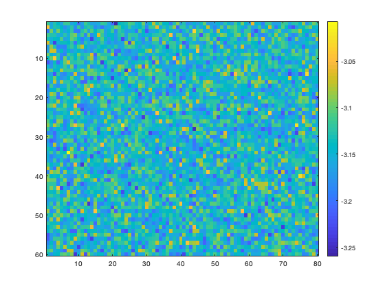
Might look like noise at first, but that's just the noise we intentionally put in there. Note the colorbar scale--all of the values center around negative pi, exactly as expected.
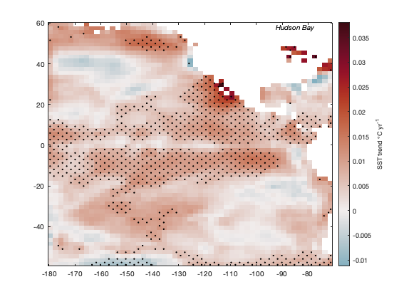
Example 4a: Sea surface temperatures
Load the sample pacific_sst.mat dataset, which contains monthly gridded sea surface temperature data, and calculate trends.
load pacific_sst

[tr,p] = trend(sst,12);

figure
imagescn(lon,lat,tr)
cb = colorbar;
ylabel(cb,'SST trend \circC yr^{-1}')
cmocean('balance','pivot') % sets the colormap with zero in the middle

Mark regions of statistical significance with stippling. First, that means defining statistical significance. Let's say everything with a p-value less than 0.01 is statistically significant:
StatisticallySignificant = p<0.01;
Identify significant regions with the stipple function. One small catch is stipple insists on gridded inputs, so we'll have to turn those lat and lon arrays into grids with meshgrid:
[Lon,Lat] = meshgrid(lon,lat);

hold on
stipple(Lon,Lat,StatisticallySignificant)
text(-85,60,'Hudson Bay','vert','top','horiz','center','fontangle','italic')
Example 4b: The 'omitnan' option
The keen observer may have noticed that in the figure above, the trend is undefined in the Hudson Bay. However, we do have a lot of good data there! Take a look at the total number of finite measurements in the SST dataset:
figure
imagescn(lon,lat,sum(isfinite(sst),3))
cb = colorbar;
ylabel(cb,'sum of finite sst measurements')
caxis([650 802])

In the figure above, we see that there are more than 600 good SST measurements in Hudson Bay, and even though that's not the full 802 month record, it should be plenty to calculate a least-squares trend. In this case we can use the 'omitnan' option:
[tr,p] = trend(sst,12,'omitnan');

figure
imagescn(lon,lat,tr)
cb = colorbar;
ylabel(cb,'SST trend \circC yr^{-1}')
cmocean('balance','pivot') % sets the colormap with zero in the middle

hold on
stipple(Lon,Lat,p<0.01) % marks the statistically significant areas

Above we see that there has been a warming trend in Hudson Bay, and it is statistically significant.
Author Info
This function is part of the Climate Data Toolbox for Matlab. The function and supporting documentation were written by Chad A. Greene of the University of Texas at Austin.