plotpsd documentation
This function plots a power spectral density of a time series using the periodogram function. Requires Matlab's Signal Processing Toolbox.
Back to Climate Data Tools Contents.
Contents
Syntax
plotpsd(y,Fs)
plotpsd(y,x)
plotpsd(...,LineProperty,LineValue)
plotpsd(...,'logx')
plotpsd(...,'db')
plotpsd(...,'lambda')
h = plotpsd(...)
Description
plotpsd(y,Fs) plots a power spectrum of 1D array y at sampling frequency Fs using the periodogram function. Sampling frequency Fs must be a scalar.
plotpsd(y,x) plots a power spectrum of y referenced to an independent variable x. This syntax requires x and y to be of equal length and x must be equally spaced and monotically increasing. For time series, x likely has units of time; for spatial analysis x may have units of length.
plotpsd(...,LineProperty,LineValue) specifies the plot's line style with any combinations of LineSpec properties (e.g., 'color','r','linewidth',2, etc).
plotpsd(...,'logx') specfies a semilogx plot.
plotpsd(...,'db') plots power spectrum in decibels.
plotpsd(...,'lambda') labels horizontal axis as wavelengths rather than the default frequency. Note, this syntax assumes lambda = 1/f.
h = plotpsd(...) returns a handle h of the plotted graphics object.
Example 1: Train whistle
Using the inbuilt train whistle example, plot start by plotting the time series for context:
load train
t = (0:length(y)-1)/Fs;

plot(t,y)
box off
xlabel 'time (s)'

If you have headphones on, you can play that train whistle like this:
soundsc(y,Fs)
The power spectrum of the train signal looks like this:
plotpsd(y,Fs)
xlabel 'frequency (Hz)'

This makes the three horns of the train quite clear! Don't like the default thin blue line? Plot a fat red line instead:
plotpsd(y,Fs,'color','red','linewidth',4)
xlabel 'frequency (Hz)'

Want to see that as a magenta line plotted in decibels?
plotpsd(y,Fs,'m','db')
xlabel 'frequency (Hz)'

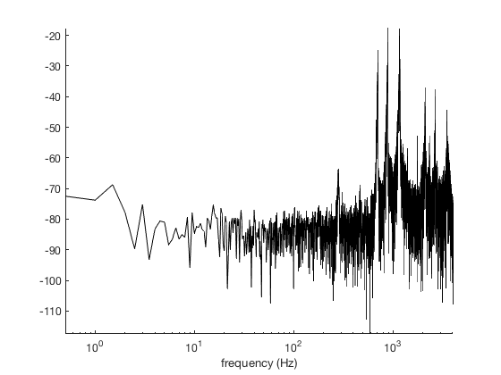
Here's a black line with decibels on the vertical scale and a log scale in the horizontal direction.
plotpsd(y,Fs,'k','db','logx')
axis tight
xlabel 'frequency (Hz)'
Suppose you have some measurements y tied to some time vector t and you don't want to go through the effort of calculating the sampling rate. If this is the case, simply enter t instead of Fs:
plotpsd(y,t,'b:','logx')
xlabel 'frequency (Hz)'

Example 2: Sea ice extent
Load this sea ice extent data that comes with CDT, and only use data from after 1988 because the stuff before then wasn't at daily resolution:
load seaice_extent.mat % some sample data that comes with CDT

% Indices of dates since 1989:
ind = t>datetime(1989,1,1);

figure
plot(t(ind),extent_N(ind))
ylabel 'northern hemisphere sea ice extent (10^6 km^2)'
box off % removes the ugly, contraining frame
axis tight

That clearly has some periodicity to it. We can use doy to make a scatterplot of all the data relative to the julian day of year:
jday = doy(t);

scatter(jday(ind),extent_N(ind),10,datenum(t(ind)),'filled')
cb = cbdate('yyyy');     % formats the colorbar as dates
set(cb,'ydir','reverse') % flips the colorbar axis
axis tight
ylabel 'northern hemisphere sea ice extent (10^6 km^2)'
xlabel 'day of year'

From the two figures above, we can expect the sea ice extent time series to have energy at the 1/yr frequency in addition to some long term trends which should be represented as broadband energy in the low frequencies.
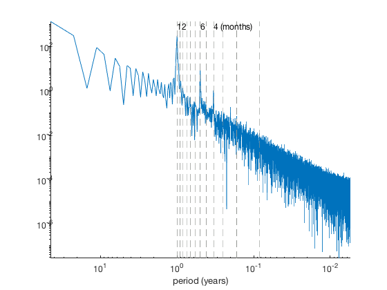
Plot the power spectral density as a function of period (here, lambda), assuming a sampling frequency of 365.25 equally-spaced samples per year:
figure
plotpsd(extent_N(ind),365.25,'lambda')
set(gca,'xscale','log','yscale','log')
axis tight
xlabel 'period (years)'

As expected, a peak at the 1 year period stands out. But there are also a few other minor peaks, particularly at the 6-month and 4-month periods. Use vline to show them:
vline((1:12)/12,'--','color',rgb('gray'))

yl = ylim; % y limits of the plot
text(12/12,yl(2),'12','vert','top')
text(6/12,yl(2),'6','vert','top')
text(4/12,yl(2),'4 (months)','vert','top')
Author Info
This function and supporting documentation were written by Chad A. Greene of the University of Texas at Austin's Institute for Geophysics (UTIG), October 2015. Adapted for the Climate Data Toolbox in 2019.